Our New Logo: The Class Central Chalkboard
We’re happy to introduce our new logo and symbol. This is the ordinary story behind it.
We are happy to introduce the new Class Central logo and symbol — the Class Central Chalkboard.

The Story Behind the Logo
A new logo was not exactly planned, but we have been mulling over the idea for some time. In fact, I explored designs on multiple occasions since I started working with Class Central in 2017. My efforts had proven futile.
We knew what we wanted — something with more versatility, something a bit more modern, and something that possibly moved away from the blue’s stark brightness — but we couldn’t figure out what would work.

If there’s a moral of this story, it is “get feedback early and often.” I’d mostly kept previous design bouts from Dhawal (Class Central founder and CEO) and the team since it wasn’t a priority and I only wanted to present something if I felt I’d nailed it. I ignored that age-old advice.
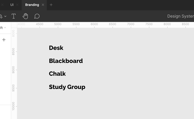
A few months ago, I again began exploring ideas for a logo. This time I was more determined, and instead of hoping to land on something that I could surprise Dhawal with, I immediately started showing him my raw designs. Our conversations spurred him to give me a list of some ideas:

At this point, I’d been hung up on the idea of a “train station.” When I first met Dhawal in 2014, I’d just moved from New York City, and the first thing I thought of when I heard the name Class Central was “oh, so it’s like the Grand Central Station of online courses.” I still liked this seed of an idea, but everything I tried around it fell flat. It was either too complicated or too cheesy. So I decided to give my train dream a break and try out a few of Dhawal’s suggestions.
20 minutes later, I came up with the first iteration of the Class Central Chalkboard. As soon as I showed Dhawal, he immediately felt there was something. From there, we honed in on all the pieces.
1. Versatility
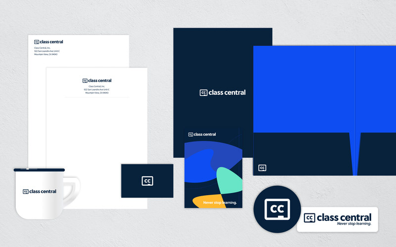
Having versatility was an important factor – the modern digital standard of a logo. Could the symbol stand on its own and be used easily at various sizes? We tested it out.


2. Wordmark
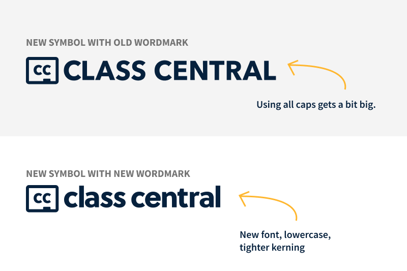
We then tweaked the “Class Central” wordmark. All caps for the full logo (that includes the chalkboard symbol) was far too big. However, by tightening the kerning and using lowercase, it felt much more balanced and took up much less real estate.
3. Color
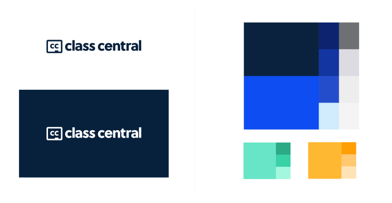
We also had trouble over the years with the brightness of the blue. For some users, the bright blue logo was a bit jarring. It also drew a lot of attention, which competed with the rest of the site. We didn’t want to get rid of the Class Central “blue”, however, reining in the logo’s brightness by moving to a deep navy helped bring down the overall “blue” noise.
Over the coming months, we will continue to refine interfaces across Class Central from this new basis. It has given us a new freedom to use the brighter blue more selectively for the most important actions.

Truth Be Told
The story of our new logo isn’t all that glamorous. In fact, it is quite ordinary — sometimes you work for days, weeks, or even months on something and nothing comes of it. And then, in a brief 20-minute session, you land on the idea.
As the moral of the story goes — and if you are ever designing a logo yourself — be sure to get feedback early and often. You never know when a colleague will give you a list of random things and one of them will fit just right.


Randi
You know what I initially saw when the logo started “playing” in my email? A laptop. Which makes sense since the classes are online. And then as it completed its loop, it was obvious it was a chalkboard which of course also makes sense. I don’t know if this was intentional and unless I missed it, I didn’t see anything in the article speaking to that. But as a graphic designer myself, I have to say this is quite genius. I love the transition from a laptop to a chalkboard! It says so much in so little… traditional infused with the new—tried and true and classic and rooted, infused with advancement, technology, innovation. Win win all the way around. Even as a static logo, I still see both. I wonder if I would have had I not seen it in motion first, but it doesn’t really matter, it still works and is a win even static, whether I see one or both. Well done.